


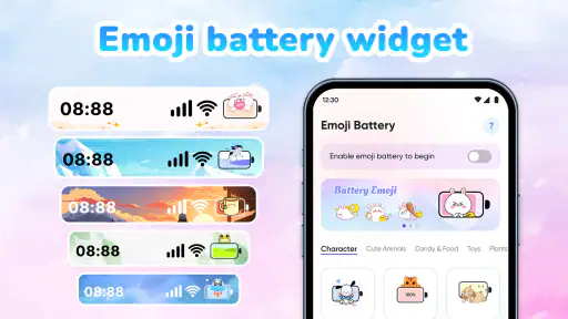
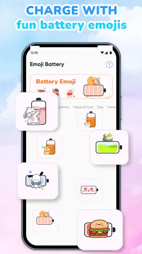
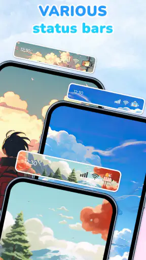
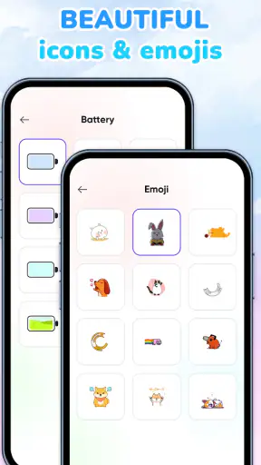
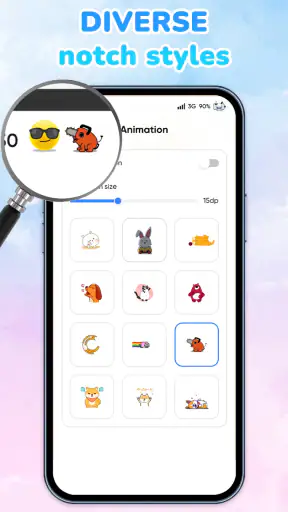
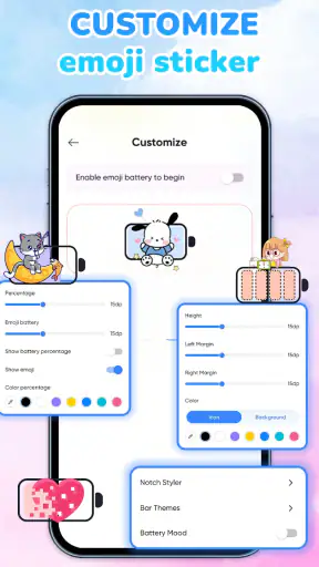
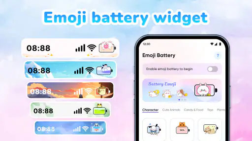
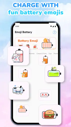
I like personalization apps that change how a phone feels without forcing me to rebuild the entire interface. Emoji Battery: Status Bar takes that small-change approach: it turns battery awareness into a visual detail, using emoji styling, widgets, icons, and notch-oriented designs instead of treating the battery indicator as something purely functional. After spending time with it, I see the appeal immediately for anyone who wants a more playful phone without installing a full launcher or replacing every part of the system design.
This is a free personalization app from HoangSi, aimed at Everyone, and it has already passed the million-install mark. Its average rating sits at 4.1 from around 1.7 thousand ratings, which suggests a generally positive response without implying that it will suit every Android setup. The current release is version 1.3.7, and it works on Android 7.0 and newer. Optional purchases range from 49 cents to $11.99 per item, so the basic idea is easy to try while some customization may sit behind payments.
How the app feels in everyday use
A quick visual change rather than a complete makeover
The strongest part of the concept is its focus. Many personalization tools ask me to change wallpapers, icon packs, launchers, lock screens, or entire themes. This app concentrates on one of the phone elements I check repeatedly: the battery display. That makes the result more noticeable than a wallpaper but less disruptive than a full interface replacement.
I can imagine using a bright emoji battery style on a personal phone while keeping a quieter design on a work device. The choice is not only about decoration. A distinctive battery indicator can make the status bar easier to recognize at a glance, particularly when the default system symbol blends into a crowded top edge. The trade-off is that playful graphics may be less immediately clear than a standard battery outline, especially when I am in a hurry.
The app’s collection of widgets gives the idea more room to work. A status-bar change is subtle and always visible, while a widget can become a deliberate part of a home-screen layout. I would use a larger battery widget on a secondary home page rather than filling the main page with it. That approach keeps the first screen practical while still making the personalization visible when I want a clearer battery check.
Perceived speed and the first setup
For this kind of app, speed is less about demanding animation and more about how quickly a chosen style becomes useful. The app is built around lightweight visual customization, so I would expect the selection process to feel more immediate than using a complete launcher or system-wide theme package. That is an important advantage for people who want a small experiment instead of a long setup session.
The first useful workflow is simple: choose one battery treatment, place a widget only if it adds information, and leave the rest of the interface alone. I recommend resisting the temptation to change every available element at once. Testing one style at a time makes it easier to decide whether the emoji design is genuinely readable on your screen or merely amusing for a few minutes.
Not every phone presents the status bar in the same way. Screen cutouts, rounded corners, manufacturer overlays, and compact notification areas can affect how a decorative battery treatment feels. That is why the notch styles are more than a cosmetic extra. They address a real difference between modern phone layouts, although the best result will depend on the specific shape and spacing of the device.
What happens during heavier phone use
The moments that matter most are not when the phone is sitting idle. They are the busy periods: navigation, video playback, gaming, camera use, or a long day away from a charger. In those situations, I want the battery indicator to remain understandable even when notifications and other status icons compete for space. A colorful emoji can be more visible, but it can also become visually noisy beside other bright symbols.
Widgets introduce a separate consideration. A widget is useful when I want a larger, more deliberate battery view, but it also occupies home-screen space that could otherwise hold a calendar, shortcut, or communication tool. I would not add one automatically. If the status-bar style already gives me enough information, the widget may be unnecessary. If I frequently check battery while the phone is unlocked, then the extra space can be worthwhile.
My practical recommendation is to judge the design while the phone is doing something demanding, not only while looking at a clean home screen. Open the apps you normally use, view the status bar against both light and dark backgrounds, and check whether the emoji remains recognizable. This is a better test than choosing a style solely because its preview looks attractive.
Stability and recovery after interruptions
Personalization tools are judged by consistency. A battery style that looks good once but becomes confusing after a restart, a theme change, or a system update would quickly lose its value. I would therefore treat the first few days as a reliability check: restart the phone normally, switch between portrait and landscape where appropriate, and see whether the selected presentation still feels coherent.
There is also a difference between recovering from an ordinary interruption and recovering from a device-level change. A temporary interruption is part of normal phone use. A manufacturer update, a permission adjustment, or a system interface redesign can affect any app that works near the status bar. I would not assume that a visual customization will behave identically across every Android skin simply because the operating-system minimum is supported.
If the display ever feels wrong, the safest recovery path is to return to a simpler style before experimenting again. I would remove any optional widget first, then select a plain battery treatment, and only afterward try a different emoji or notch arrangement. This staged approach makes it easier to identify whether the issue comes from the selected design, the home-screen layout, or the phone’s own status-bar behavior.
Resource demands and sensible expectations
The app’s purpose is visual, so I would not choose it expecting a major productivity boost or a battery-saving system utility. Its value is expressive rather than technical. A decorative battery display may help me notice battery status, but it does not change the phone’s battery capacity or replace the system’s underlying information.
I also would not install it on a phone where every pixel and shortcut matters. On a small display, a widget can make the home screen feel crowded, and a detailed emoji design may compete with notifications. A minimalist system indicator, a manufacturer’s own widget, or a conventional battery utility may be a better choice for someone who values maximum clarity over personality.
For ordinary use, the sensible expectation is modest: the app should make the battery view more fun and more visually distinctive, not transform overall device performance. That distinction matters because personalization apps can be enjoyable while still being unnecessary. I see this one as a low-commitment layer on top of the phone, not as an essential tool that should remain active at the center of every workflow.
Comparing it with the usual alternatives
The closest alternative is the battery indicator already built into Android or supplied by the phone manufacturer. That option is usually the better choice for people who want the clearest possible reading with no extra visual layer. It is also the natural fallback when a phone has an unusually shaped status bar or a heavily customized interface.
A full launcher or icon pack offers much broader personalization, but it also changes more than many people want. I prefer this app when the goal is specifically to make battery status playful while keeping the existing home-screen arrangement. In contrast, I would choose a launcher when I want a coordinated redesign involving app icons, gestures, folders, and page layouts.
Dedicated widget apps can provide more practical information, such as several device readings in one place, but they may feel less focused. The appeal here is that the battery theme, emoji presentation, icons, widgets, and notch styling belong to one recognizable idea. That coherence is its advantage, provided I am comfortable with decoration taking priority over a strictly utilitarian display.
Who will get the most from it
This app makes the most sense for someone who checks battery often but finds the standard indicator dull. It is also a good fit for users who enjoy matching small interface details to a mood, wallpaper, or personal style without committing to a complete theme. Because it is free to start, I can test the idea without treating the decision as a major purchase.
It could also work well for a shared household device used by younger family members, especially because the content rating is Everyone. I would still choose a clear design for anyone who relies on the phone for work, travel, or emergency communication. A cheerful battery symbol is useful only when I can interpret it quickly.
I would skip it if my priority is absolute minimalism, maximum consistency with the manufacturer’s interface, or a single dashboard containing many technical readings. I would also hesitate on a phone with very limited home-screen space if I already depend on several widgets. In that situation, the standard battery indicator may be the more sensible solution, even if it is less entertaining.
Useful ways to test the customization
One good workflow is to begin with the status-bar treatment and use it for a full day before adding anything else. This reveals whether the emoji is readable during normal notifications, calls, media playback, and outdoor use. Only after that would I add a widget, because the widget should solve a visibility problem rather than simply consume space.
A second approach is to match the style to the phone’s visual environment. On a busy wallpaper, a small, high-contrast battery treatment may be easier to recognize than a detailed emoji. On a clean home screen, a larger widget can become an intentional design element. The best-looking choice in the app’s selection screen is not necessarily the best choice once it sits beside real notifications and icons.
A third useful test is to compare the customized display with the system battery page when the phone is under pressure. If I am traveling or using navigation, I want the decorative indicator to lead me to the right decision: charge now, reduce usage, or continue normally. If the symbol makes that judgment slower, I would simplify the design rather than forcing myself to keep it.
Purchases and long-term value
The app is free, which lowers the barrier to trying its central idea. Optional in-app items range from 49 cents to $11.99, so I would explore the free experience first and decide whether additional customization genuinely improves daily use. The most sensible purchase is the one that solves a specific preference, such as a style that remains readable on the device, rather than buying several designs that will rarely be used.
That pricing range also changes how I judge value. If I only want a small novelty for a weekend, paying for a large collection would not make much sense. If I keep the same style for months and use the widget every day, a purchase may feel more reasonable. I would make that decision after testing the app through normal routines, not immediately after seeing the most colorful options.
Because the developer is HoangSi and the app is already widely installed, it feels like a product intended for a broad Android audience rather than a one-off experiment. Still, broad reach does not eliminate device-specific behavior. My final choice would depend on whether the selected style remains stable and legible on my particular phone, especially around the notch and notification area.
My performance verdict
I see Emoji Battery: Status Bar as a focused, low-pressure personalization app with a clear reason to exist. Its perceived speed should come from the narrow scope: it is trying to make battery information more expressive, not replace the phone’s entire interface. The main performance question is therefore not whether it makes the phone dramatically faster or slower, but whether the visual layer stays readable, stable, and unobtrusive during real use.
Its best qualities appear when I want a small change with a strong visual identity. The emoji approach can make an ordinary status check feel more personal, while the widgets and notch styles give me ways to adapt the idea to different layouts. The limitations are equally clear: decorative symbols may be less direct than standard indicators, widgets can crowd a home screen, and the experience may vary with Android skins and screen designs.
My recommendation is to try the free version if you enjoy playful customization and want to keep your existing launcher. Start with one simple style, test it during heavy phone use, and add a widget only if it improves visibility. If you prefer a clean, technical, completely predictable interface, stay with the built-in battery display instead. For everyone in between, this is a fun visual upgrade, not a performance tool, and it works best when I treat it as a small finishing touch rather than a replacement for the phone’s reliable system information.


